Case Study – Poetry Book Cover Design
I had the pleasure of designing a Poetry Book Cover for DelhiPoetrySlam. DPS is an independent online portal of poems from the largest group of poets from all over India.
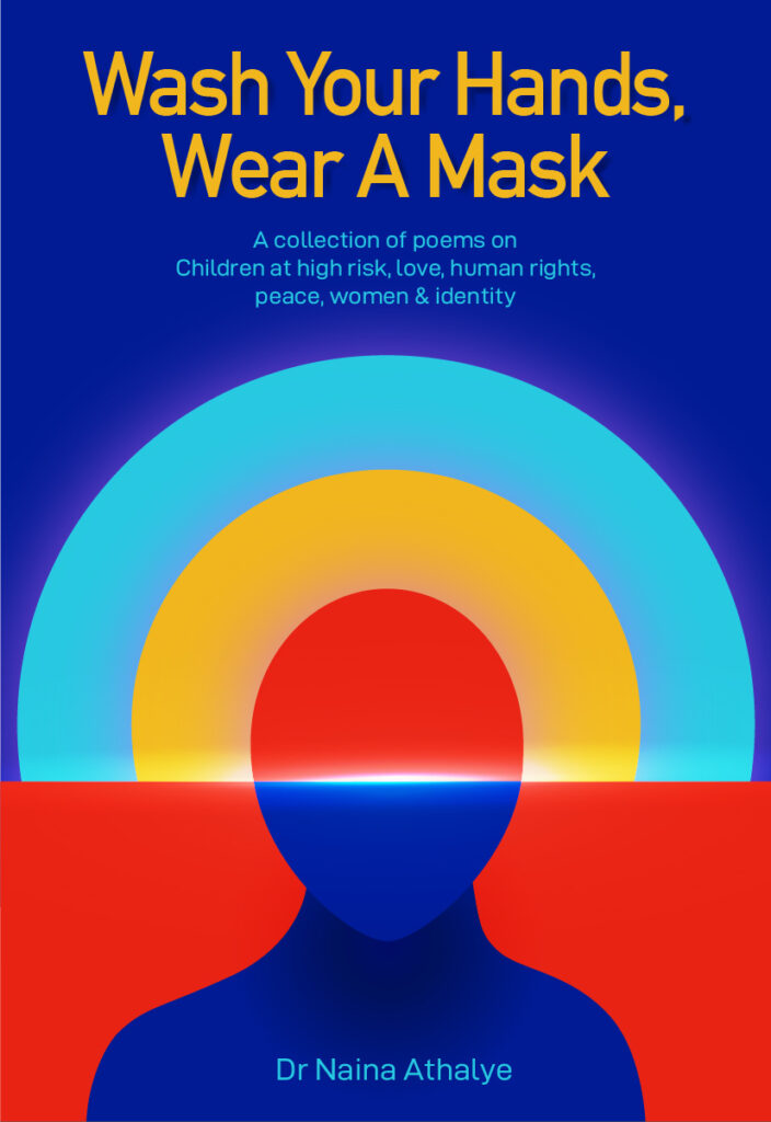
I designed the cover for the Book – Wash your Hands, Wear a Mask. The book is a lovely collection of poems on children at high risk, love, human rights, peace, women & identity, written by Dr. Naina Athalye.
Here, I am sharing my thinking process and what thoughts went behind the design of the cover.
The original visual cue for the cover design, provided by the Author and the publication copywriter was to show a lonely lamp with colorful flowers all around. Well, the thought was nice but I felt it didn’t connect with the theme and the name of the book that well.
So I checked with the author Dr. Naina directly to understand the requirements better and her preferences in terms of visuals.
She shared the manuscript of the book and I also read a few poems from the book to understand the tone better.
After thinking it through, this is what I came up with.

I didn’t share it with the client directly. It was more for my personal reference and concept clarity.
I took the sketch to my laptop and experimented a bit with the shapes, to better convey the meaning. This was the look I finalized.
Here is the conceptual idea & the thought behind the design:
The cover design of the book depicts a person and a rising sun. The face in the image speaks for all the vulnerable – the children, the women, the people in need. The emotion on the face is bare and naked but the image lights up with the sunrise which speaks of hope, positivity, and a promising future for all and that’s what the book is all about. As the poems speak of individual stories & struggles about identity, individuality, that is also the reason why a lone figure has been chosen.
To explain a bit more, the eyes (vision) and brain (consciousness) is replaced by the sunrise which shows how collectively we can envision a better future. As the book is at some level spiritual & therapeutic as well, that is also the reason this visual speaks volumes about the book and hits you hard.
The design is clean & simple yet strong, bold and on the face, just like the writings of the book. It connects all the aspects of the book – motivation, hope, as well as the title.
Another reason is as the title of the book is sarcastic and hints towards our face & body, this visual binds the title, the emotions, the tone, and the overall vibe effortlessly.
The Choice of Colors:
Colors are a powerful way of portraying emotions.
This design comes to life with yellow, red, and blue colors. I have tried to keep the color tones basic to bring maximum impact.
The client really liked the design and concept behind it.
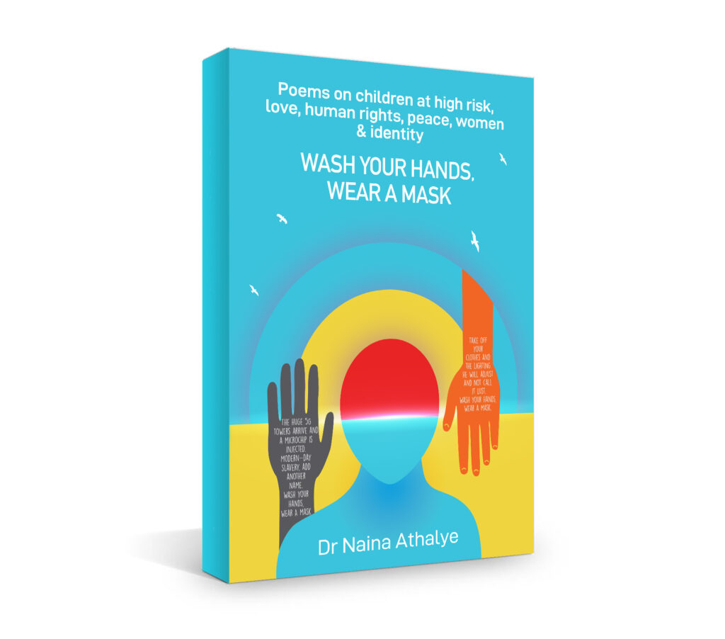
The design was improvised upon in the later stage and the colors were slightly subdued. Moreover, two hands were added showcasing a few lines from the poems.

Comment below to share your opinion on the book cover design.
The book is available on Amazon for purchase.
https://www.amazon.in/Wash-Your-Hands-Wear-Mask/dp/819447857X/ref=sr_1_3?crid=1LK6CF8P4HTR8&dchild=1&keywords=wash+your+hands+wear+a+mask+book&qid=1603865337&sprefix=wash+your+hands+wear+%2Caps%2C319&sr=8-3