Branding & Logo Design
Real Estate Client: Atlas U
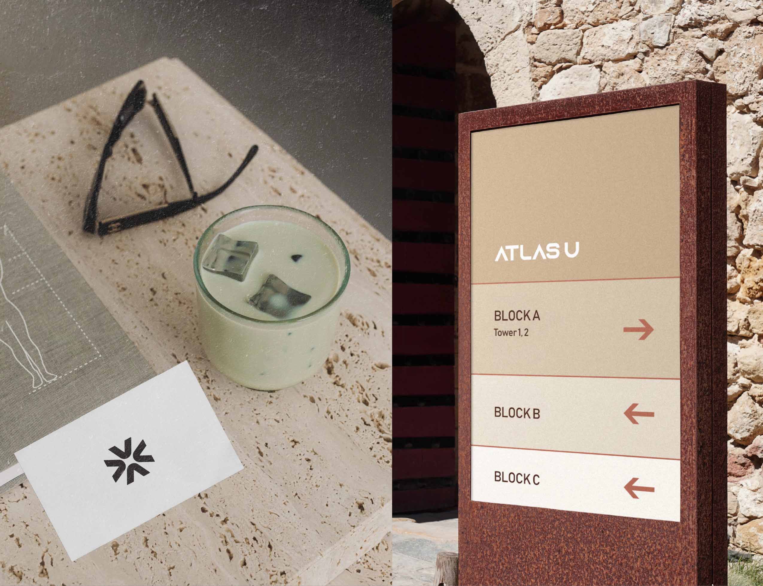
Overview
A minimal brand identity for a real estate company built around clarity, calm and direction. Atlas U positions itself as a thoughtful guide in modern living spaces.
A minimal brand identity for a real estate company built around clarity, calm and direction. Atlas U positions itself as a thoughtful guide in modern living spaces.
Challenges
Creating a visual language that balances professionalism with warmth, without leaning on overused real estate tropes. The brand needed to feel aspirational yet grounded.
Creating a visual language that balances professionalism with warmth, without leaning on overused real estate tropes. The brand needed to feel aspirational yet grounded.
Result
A refined logo system, a soft neutral palette, and a circular motif that reinforces movement and trust. The final identity feels modern, confident, and distinctly human.
A refined logo system, a soft neutral palette, and a circular motif that reinforces movement and trust. The final identity feels modern, confident, and distinctly human.
- AtlasU
- Real Estate
- Branding, Logo Design, Identity
- April 7th, 2025